




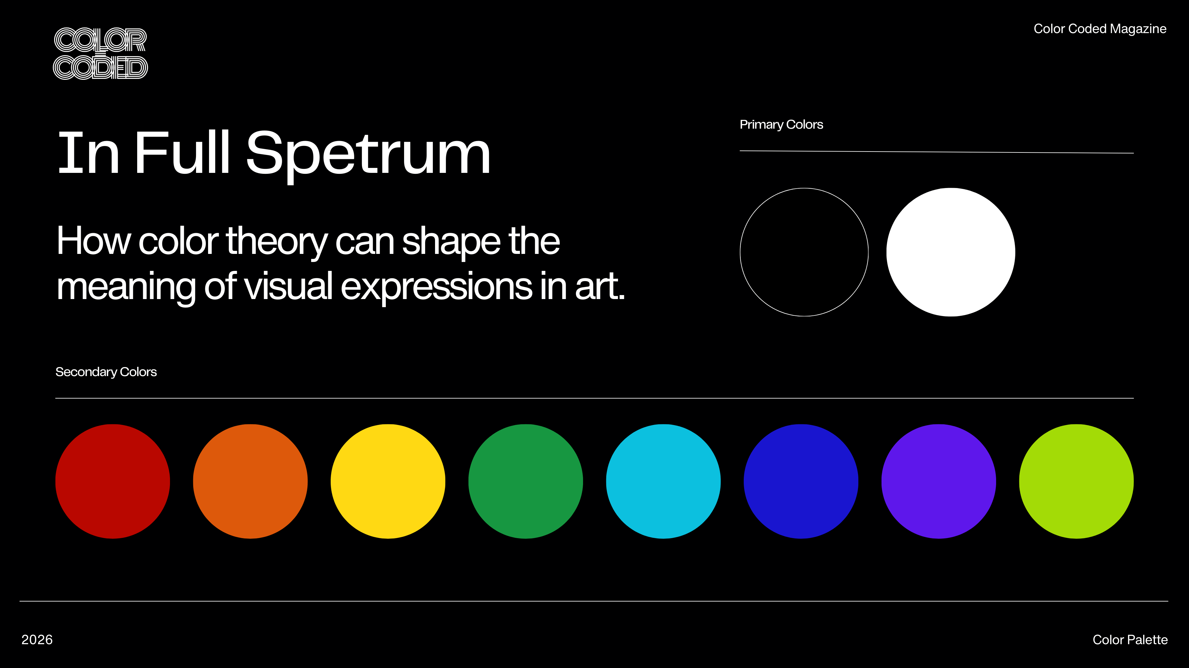
Before we have words, we have light. And the very first thing light gives us is color. It is our most primal visual language, a grammar written not in letters, but in wavelengths. To an infant, the world is a blur of high-contrast shapes and saturated hues before a single object is named. Infants know their mother’s love by ranges of shadow, light, and warmth. This tells us something profound: we understand color before we can even recognize it.
For the the visual storyteller, color is a compass, a psychological lever, and a silent narrator. To wield it with intention is to speak directly to the soul of the audience, bypassing the intellect and resonating in the gut. This is the art and science of color theory, and its application is the difference between a story that is seen and a story that is felt.
The key to understanding this language is to practice speaking and writing about art in its vocabulary and syntax.
The Vocabulary of Vision: Hue, Value, and Saturation
Every color we perceive is a conversation between three distinct elements.
- Hue is the name we give to a wavelength—red, blue, yellow. It’s the pure, resonant voice of the color itself. When we say “anger” is red or “tranquility” is blue, we are speaking in the language of hue.
- Value is the lightness or darkness of a hue. It is the volume and pitch of that voice. A pale, high-value blue whispers of a sky at dawn; a low-value, deep blue murmurs from the heart of the ocean at midnight. Value is the primary tool for creating form, depth, and drama. It’s the skeleton upon which all color is hung.
- Saturation is the intensity or purity of a hue. It’s the vibrato, the richness of the tone. A highly saturated red screams with passion and urgency. A desaturated, muted red—bordering on brown—speaks of a faded memory, a love long past, or dried blood. By turning the dial of saturation, we control the emotional volume of the scene.
These three elements form the building blocks. The stories we tell with them are built on their relationships.
The Architecture of Harmony: Building a Palette
Just as chords create harmony in music, color relationships create harmony in art. These aren’t rules set as guidelines, but they can be powerful structures for creativity.
- Complementary Colors: These are the opposites on the color wheel—red and green, blue and orange, yellow and purple. They possess a volatile, electric energy. Placed side-by-side, they intensify one another, creating a visual friction that crackles with tension. Filmmakers use this constantly. Think of the iconic movie posters for The Matrix: the sickly, desaturated green of the simulated world is the reality, but the rich, warm amber of the “real” world is its complement. The opposition of these two hues becomes a story in itself, a constant visual reminder of the film’s central conflict. It’s the color of anxiety, of clashing worlds, of a love that burns in the dark.
- Analogous Colors: These are neighbors on the wheel—blue, blue-green, and green; or red, red-orange, and orange. This harmony is peaceful, unified, and serene. There is no friction here, only a gentle, cohesive flow. A painter depicting a quiet forest glade might use an analogous palette of greens and yellows, creating a feeling of dappled calm. An analogous scheme wraps a scene in a single, dominant mood, allowing the viewer to sink into its unified atmosphere without visual interruption.
- Triadic Colors: This scheme uses three colors evenly spaced on the wheel, like the primary colors (red, yellow, blue). It is a palette of vibrancy and balance. It offers the richness of contrast without the raw tension of complements. It feels complete, playful, and full of life. Think of the worlds created by Wes Anderson, where a triadic palette of bold, saturated colors creates a sense of whimsical, controlled order. The colors dance with one another, each holding its own space in a joyful, balanced composition.
The Temperature of Emotion: Warm and Cool
Beyond the wheel, color carries an intrinsic temperature.
- Warm colors (reds, oranges, yellows) advance toward us. They’re the colors of fire, of sun, passion and danger. They feel immediate, intimate, and assertive. They’re the colors of a character’s burning ambition or a city’s chaotic, bustling energy.
- Cool colors (blues, greens, purples) recede from us. They’re the colors of water, sky, and shadow. They feel calm, distant, melancholic, or mysterious. They’re the quiet after the storm, the emotional distance between two lovers, the vast, indifferent cosmos.
Master storytellers orchestrate with temperature. A scene might begin in the cold, sterile blue of a corporate boardroom, only to shift to the desperate, warning red of a security alarm. The character’s journey is painted in the changing temperature of the light itself. A single face can be a battleground of temperatures, split between the cold shadow of doubt and the warm glow of hope.
The Context of Meaning: Relativity
This is perhaps the most crucial lesson: a color has no fixed meaning. Its story is always told in relation to its neighbors. A patch of green in a forest of blue feels different than that same green floating in a sea of red. We call this simultaneous contrast.
In one context, a vibrant purple can feel regal and mystical. In another, placed next to a sickly yellow, it becomes lurid and unsettling. A single, steady blue light on a character’s face can signify sadness, solitude, or a moment of quiet contemplation. It’s the story around it—the other colors in the frame, the action, the dialogue—that gives it its precise emotional weight. The artist’s job is to control this entire ecosystem, to ensure every hue is working in concert to tell the truth of the moment.
So, when you next watch a film, look past the actors and the plot. Look at the light. Observe how the director of photography might slowly drain the saturation from a world as a character falls into depression, or flood it with a warm, golden glow as they find love. See how a video game designer uses a desaturated, low-value palette to create a world of despair, and then places a single, highly-saturated object—a flag, a weapon, a flower—as a beacon of hope for the player to follow.
This is the deep magic of color theory. It’s the art of turning light into language, of painting not just what things look like, but what they mean. It’s the silent, gorgeous conversation happening on the screen and on the canvas, waiting for us to finally learn how to listen.
Discover more from Color Coded Magazine
Subscribe to get the latest posts sent to your email.


One thought on “ In Full Spectrum: How Color Theory Shapes Storytelling”
Comments are closed.